Siemacha
spot
The place is located in the biggest shopping center of Wroclaw, Magnolia Park, and encourages young
people to spend their time in a creative way instead of inane wandering through the shops. Siemacha
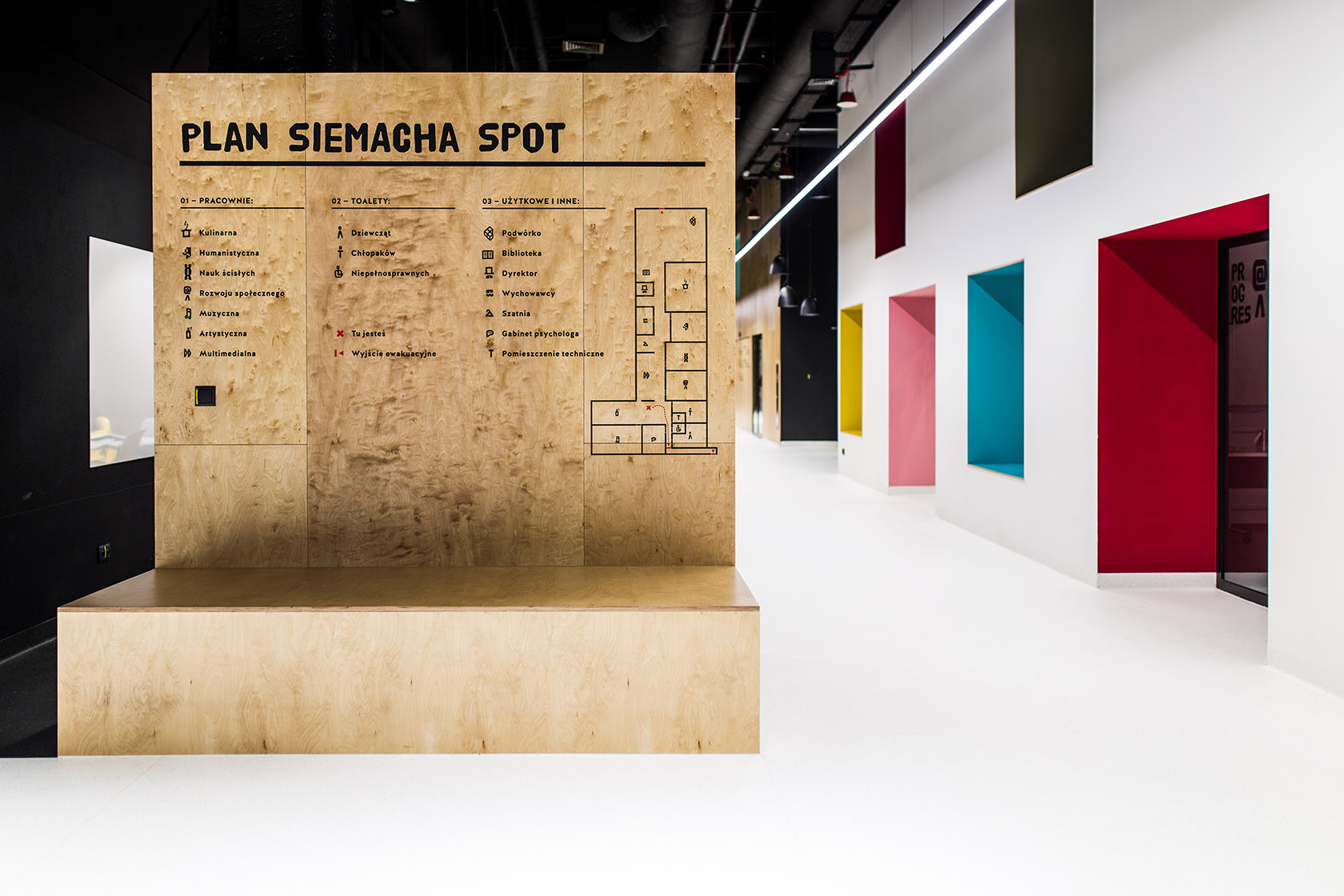
is something in between a common room and a community center. You can find there studios for cooking,
humanities, sciences, social change, music, art, multimedia and a library.
—
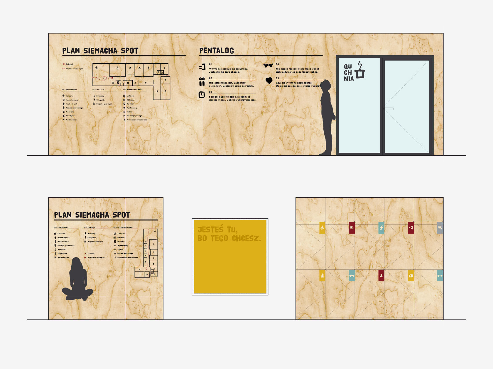
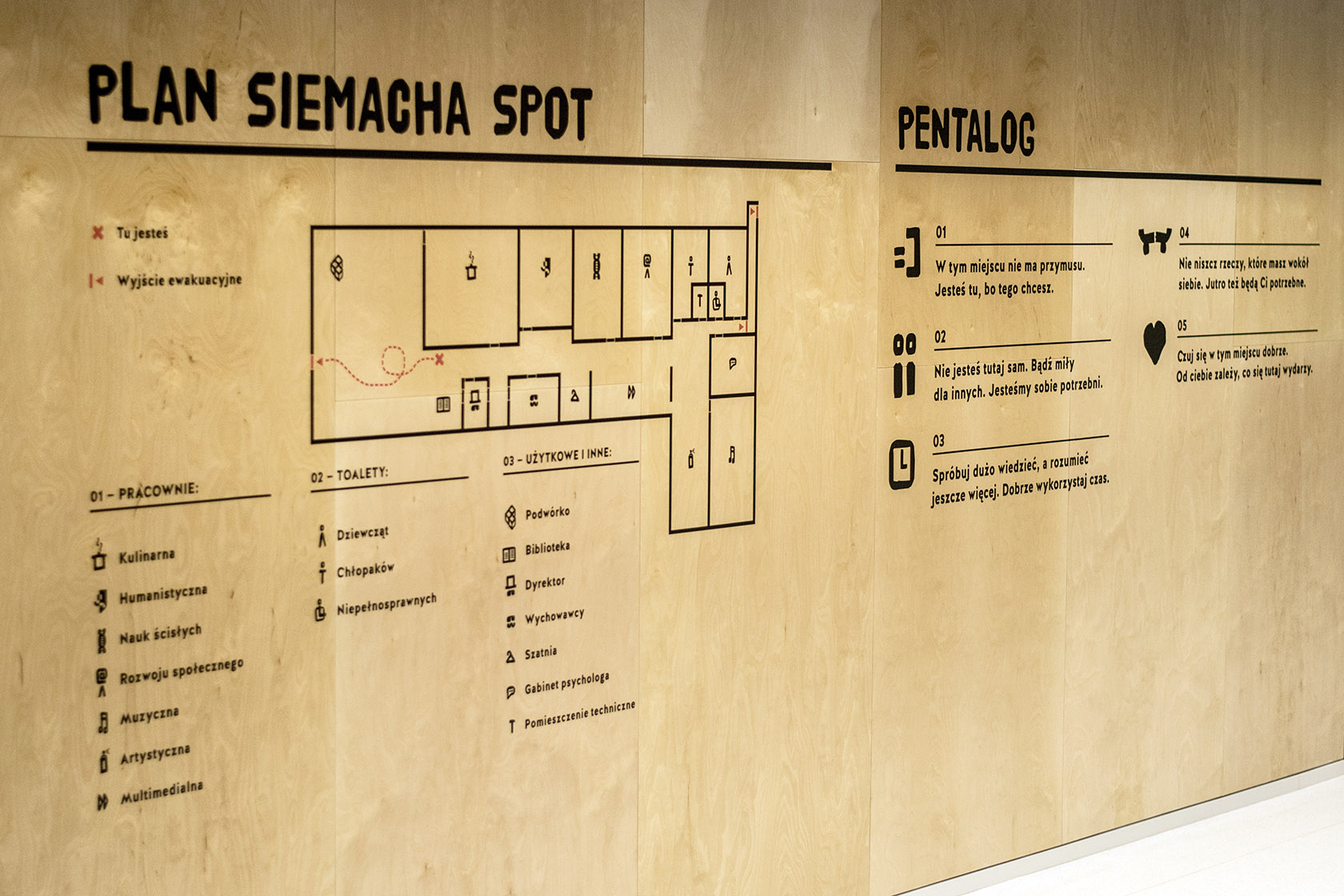
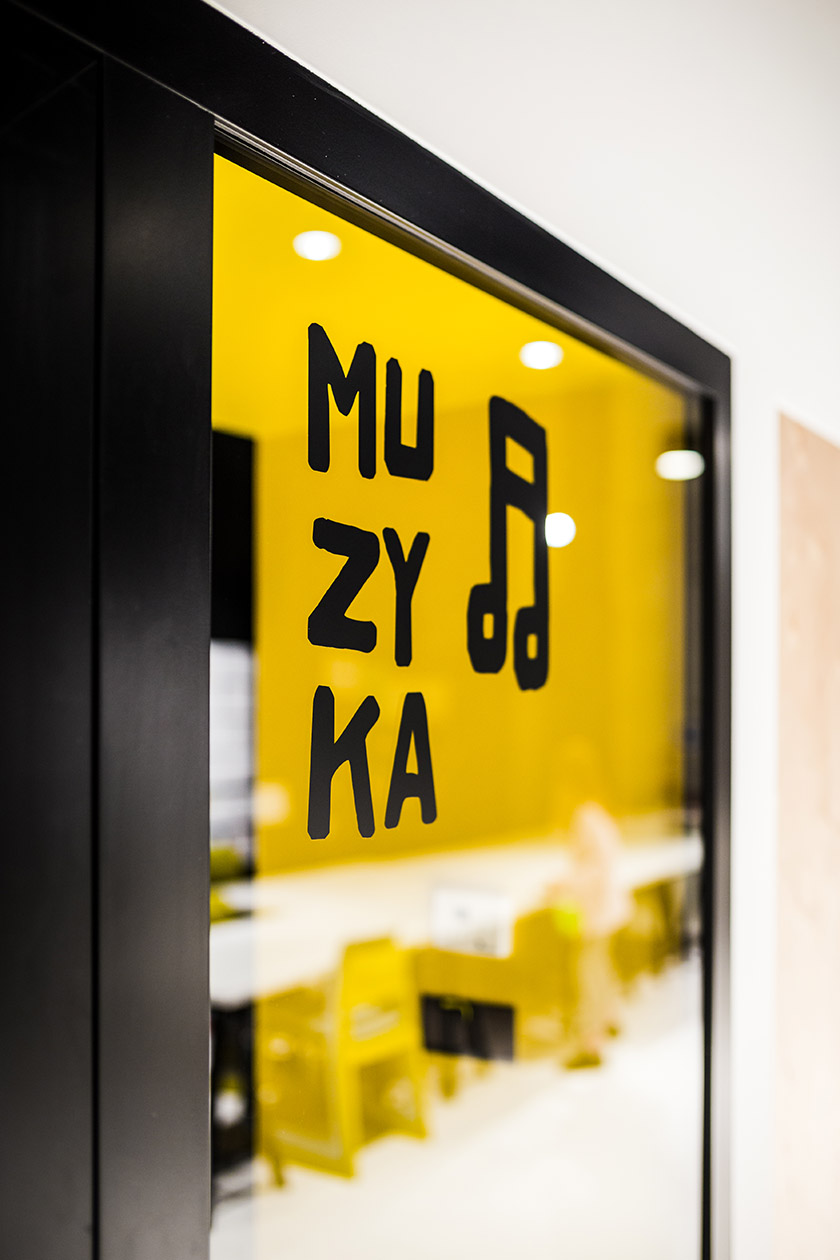
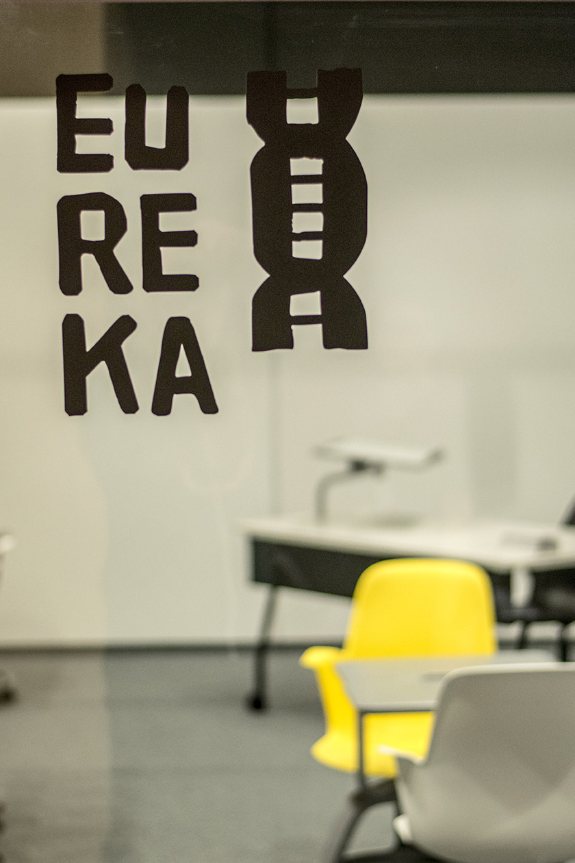
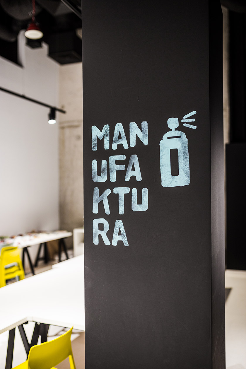
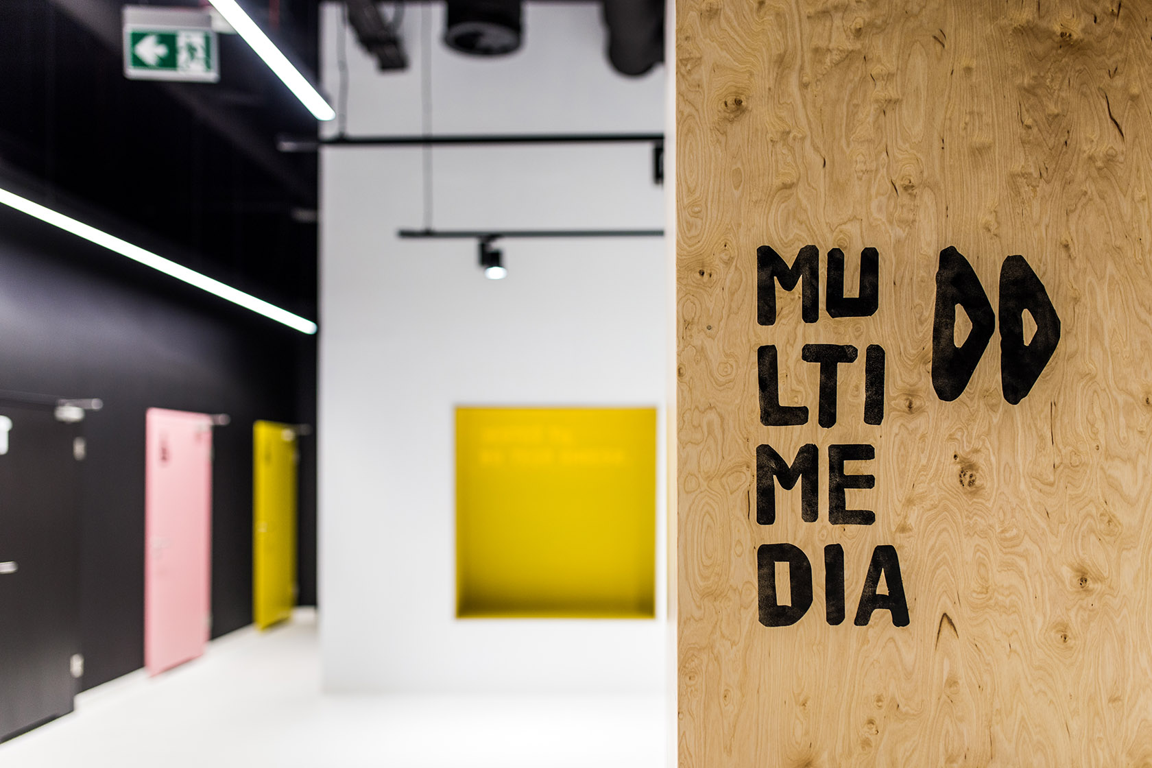
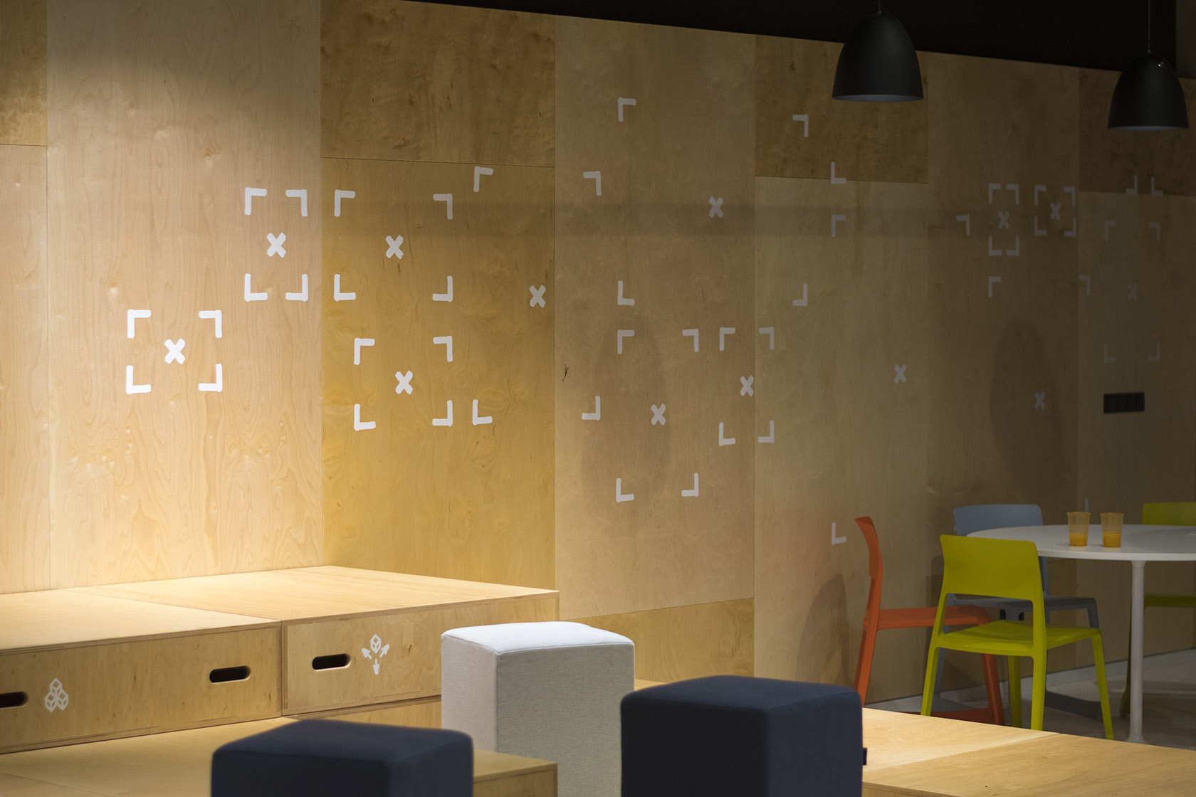
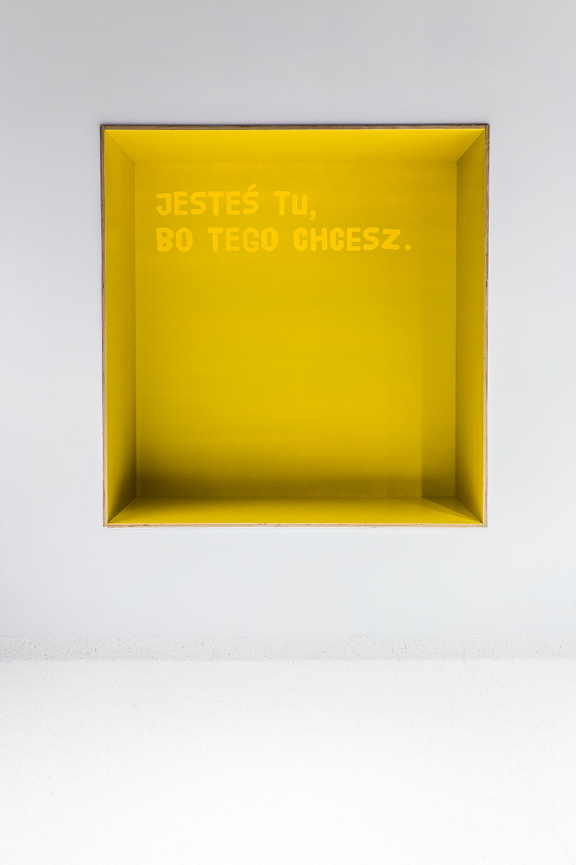
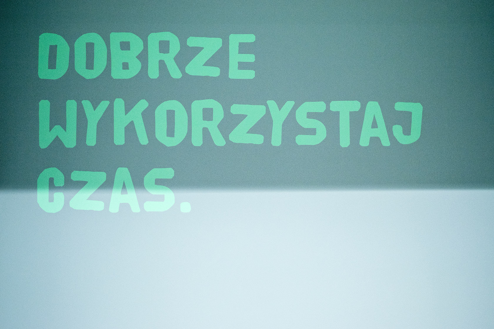
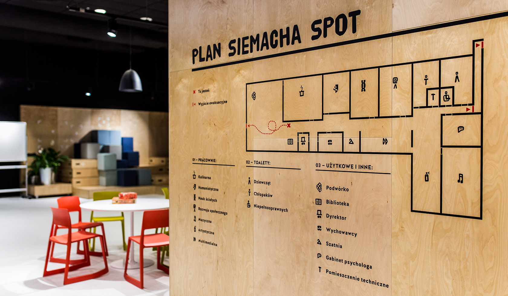
Together with Kolektyf we designed the signage and wayfinding.
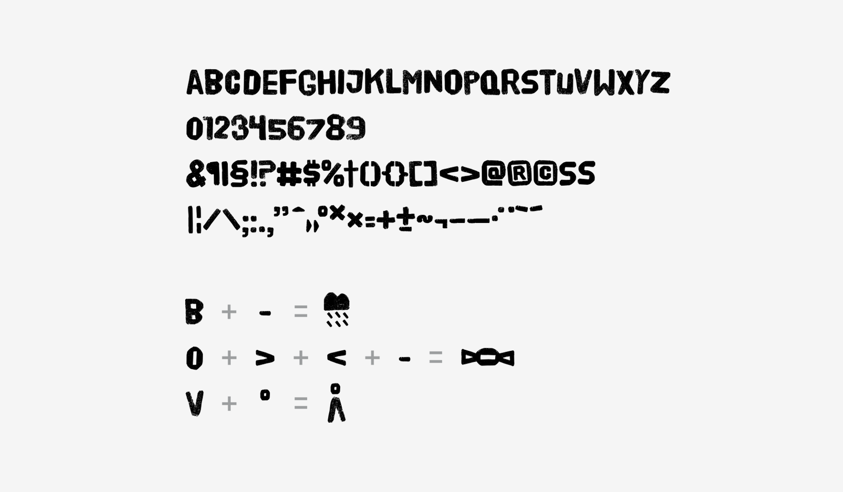
The starting point was to choose
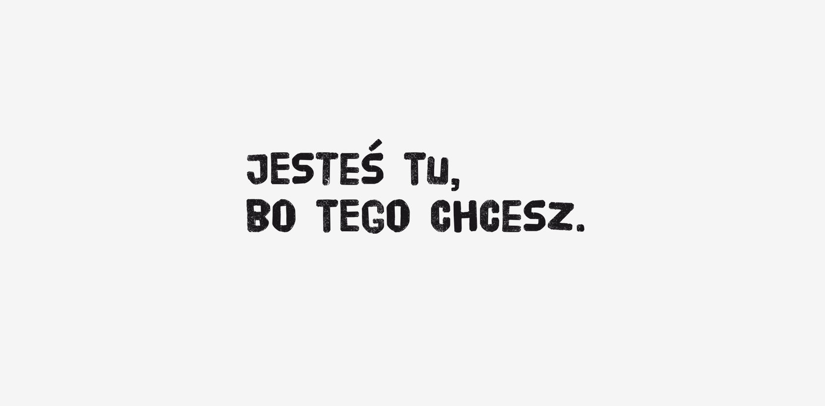
the right typeface. We decided that because of its informal character and good legibility
the best would be Poster from HDV fonts.
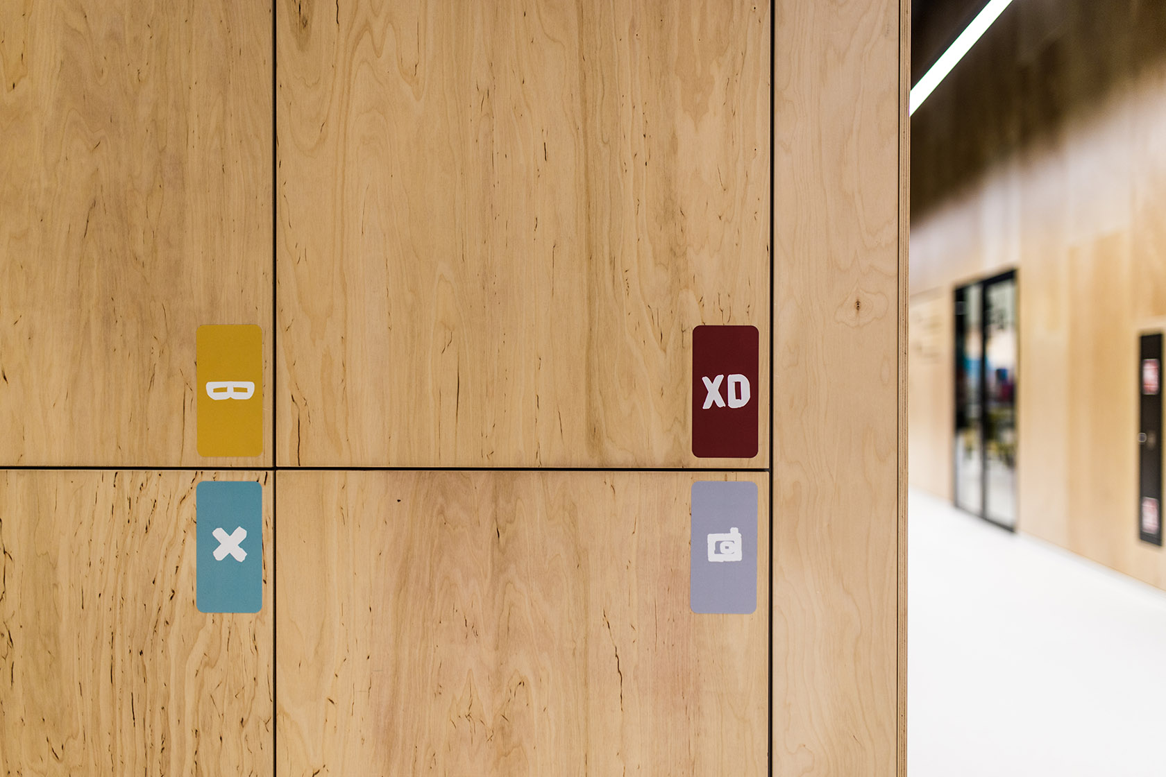
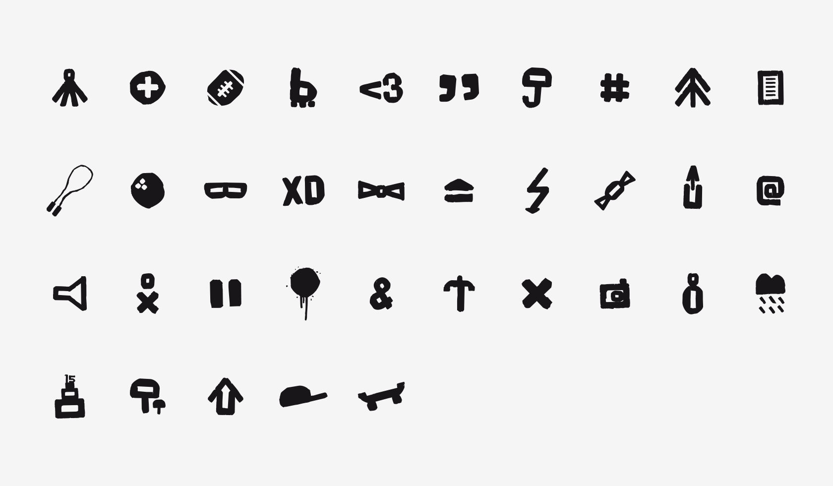
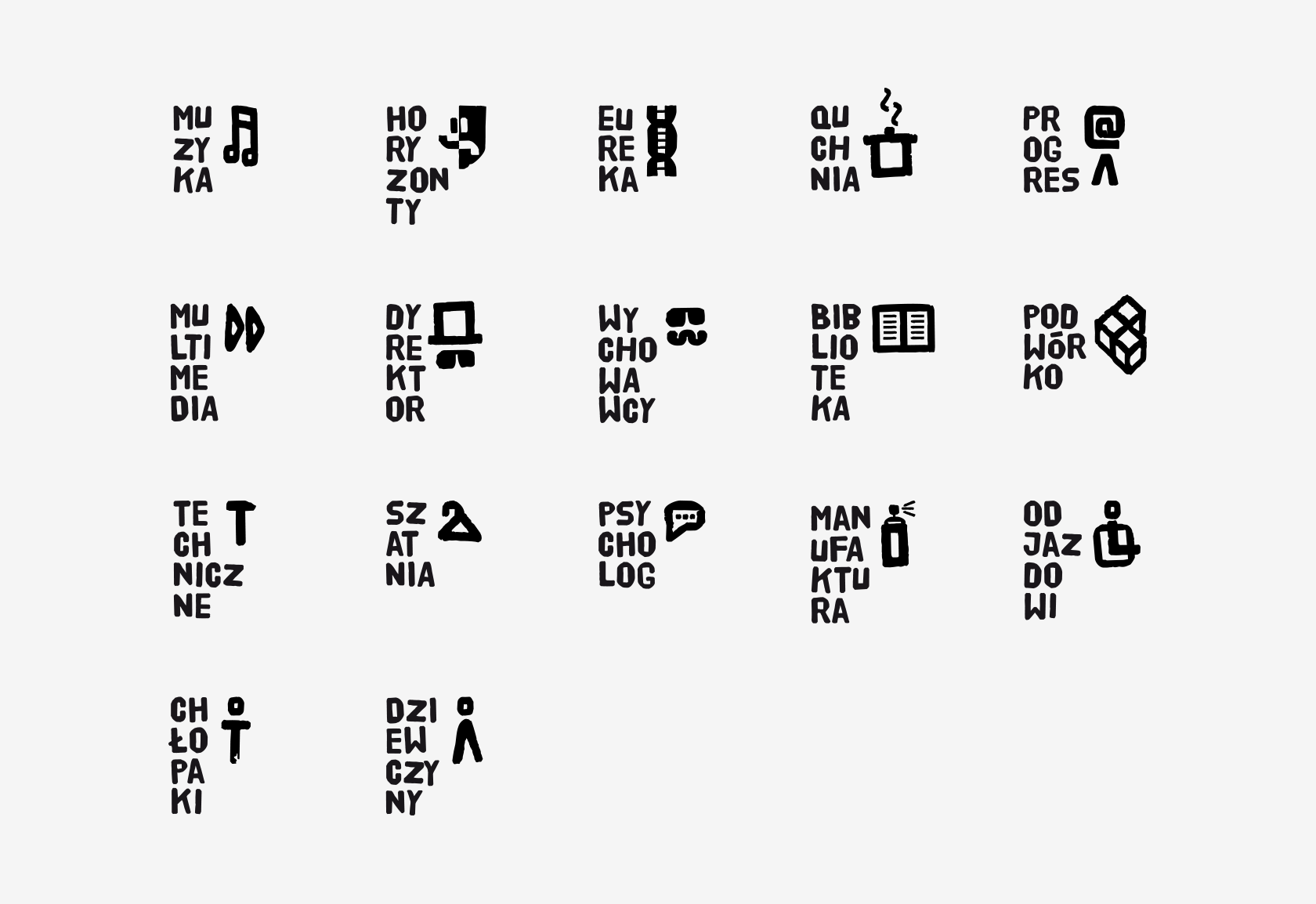
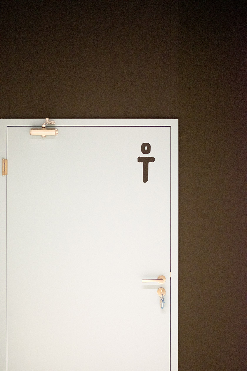
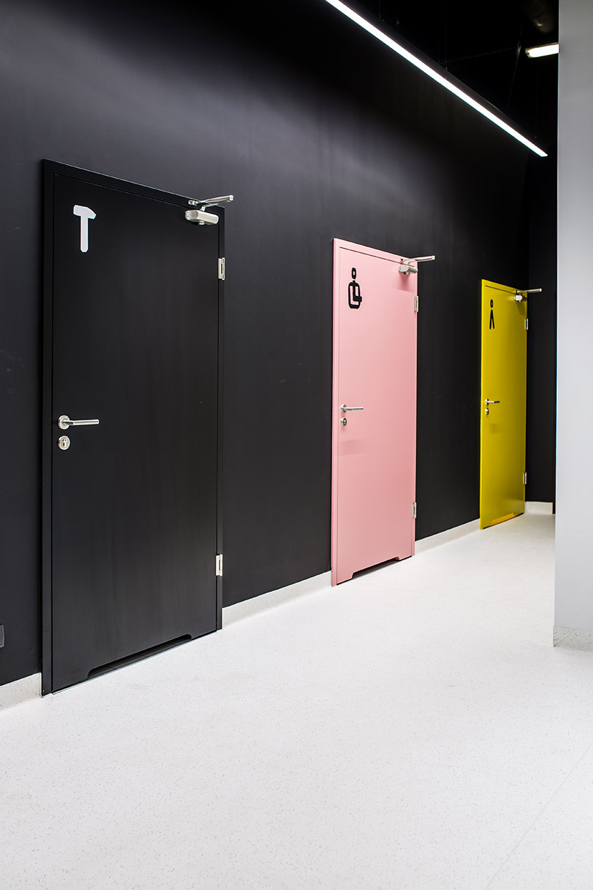
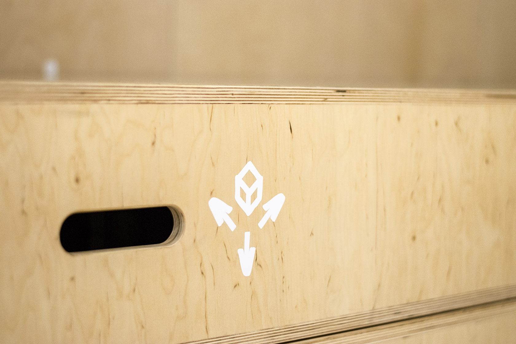
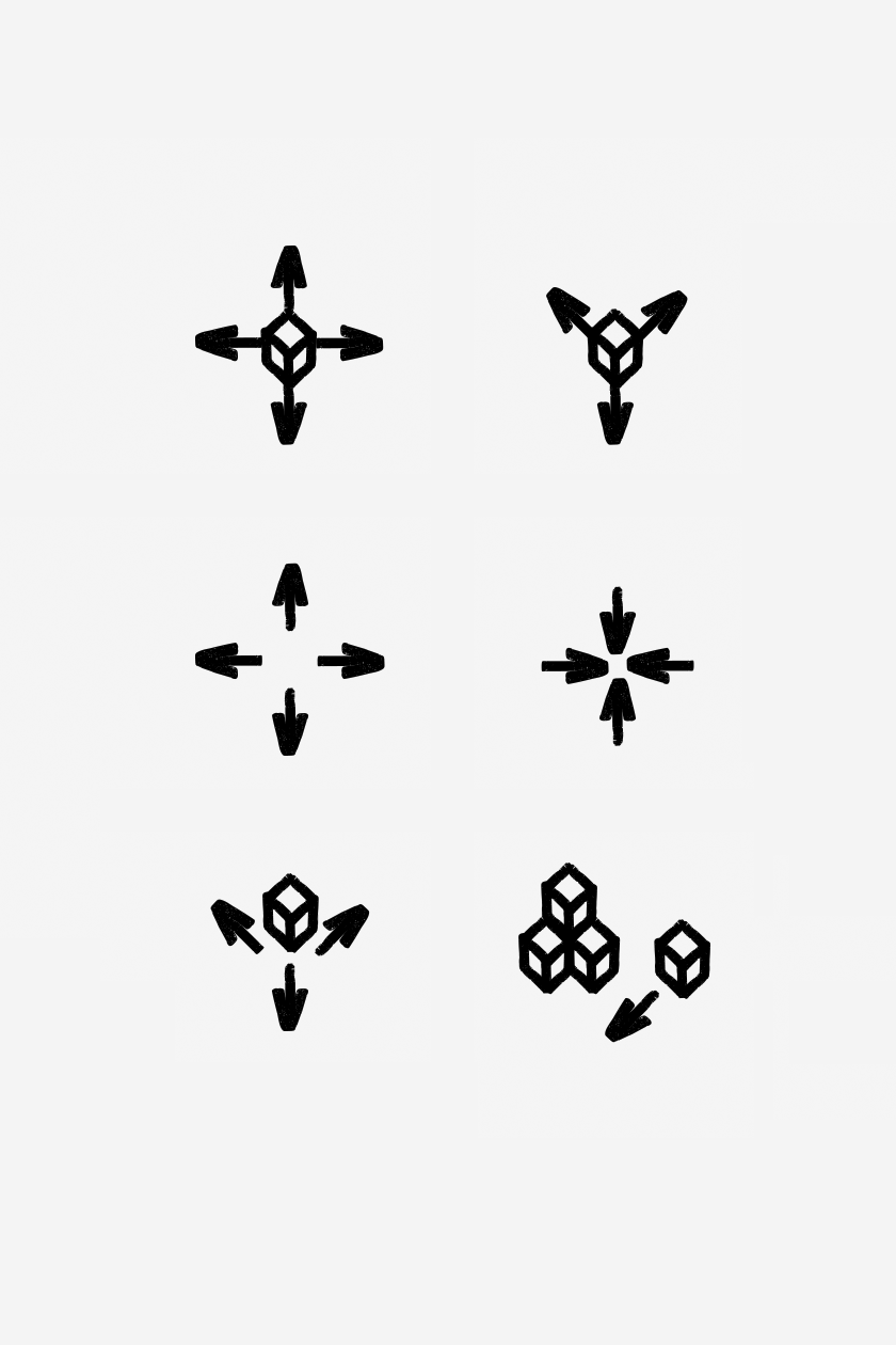
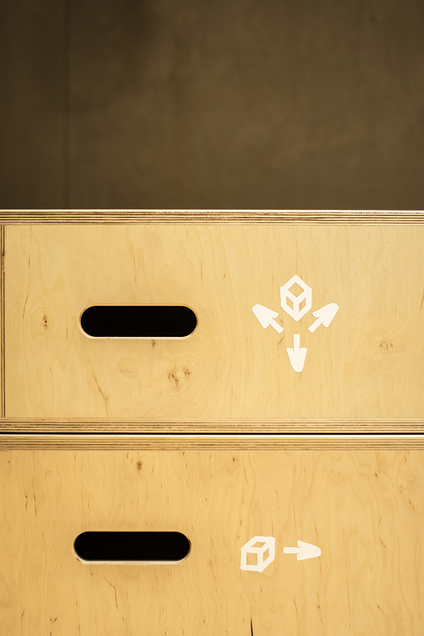
On that basis I designed about 60 pictograms which were used to mark the rooms and cabinets.
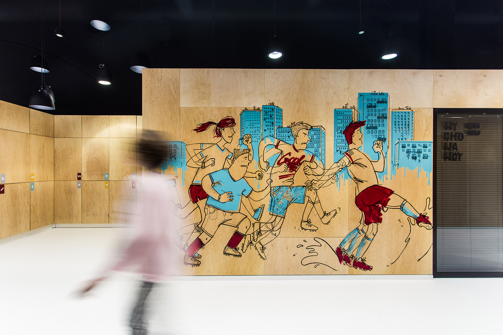
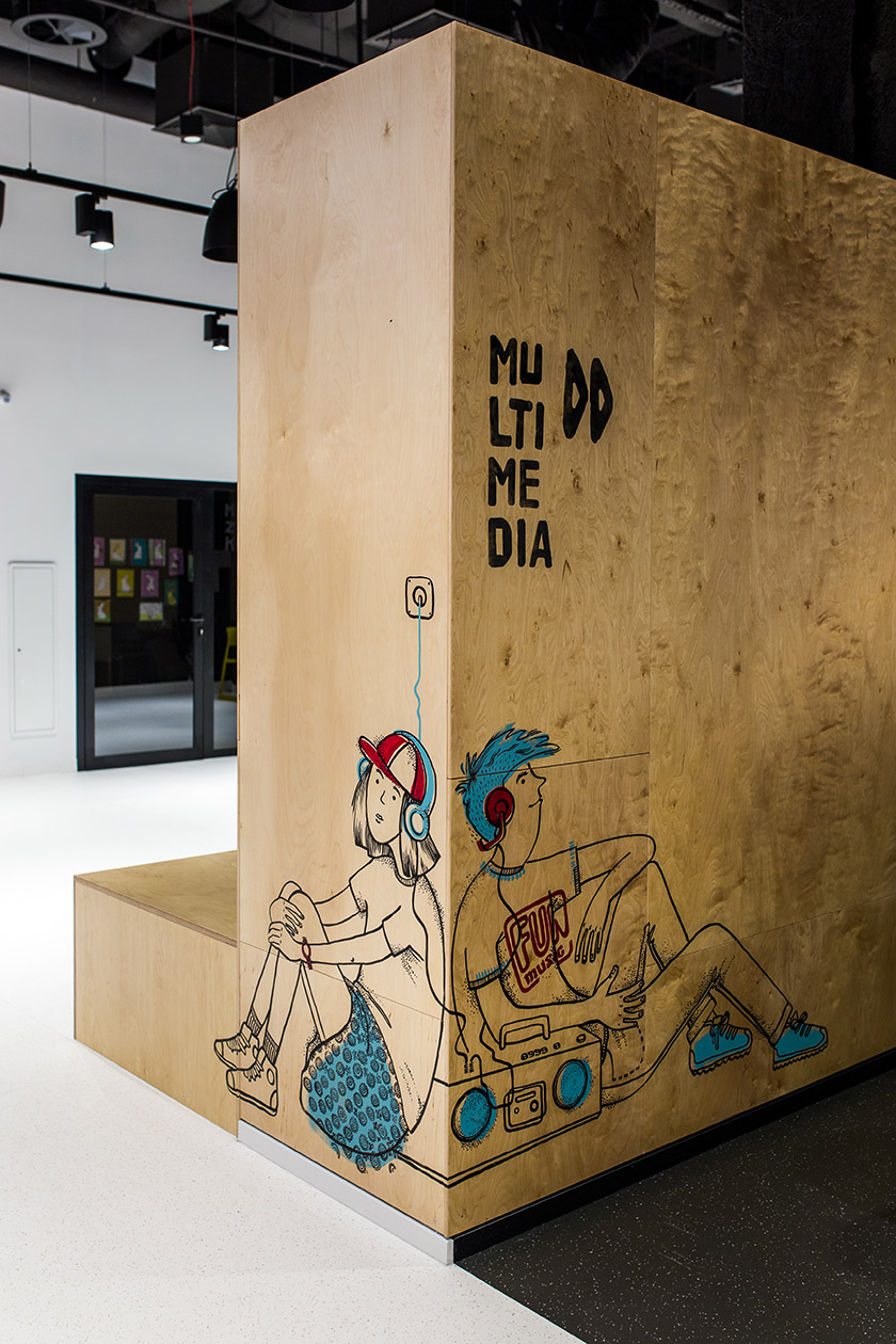
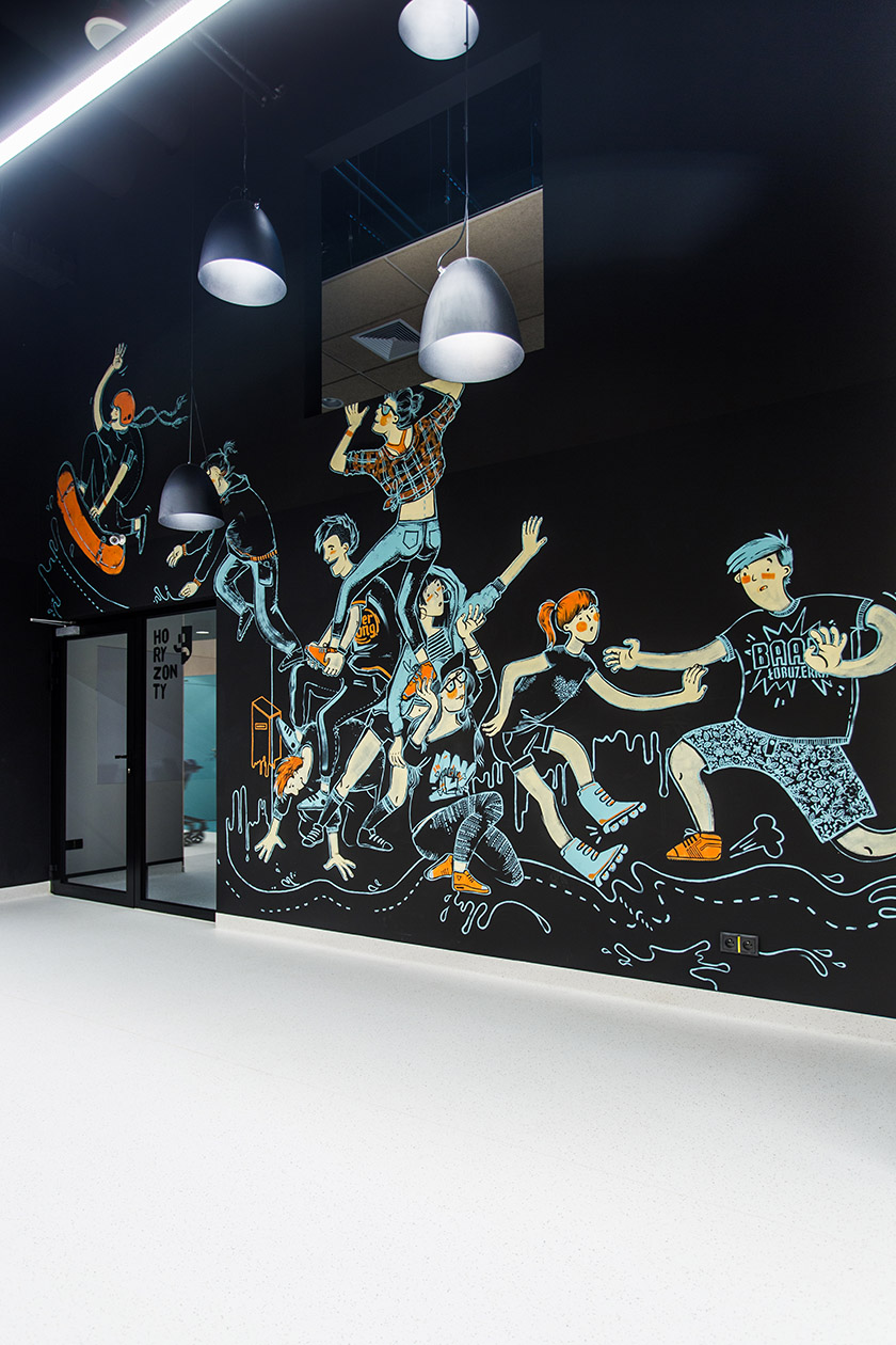
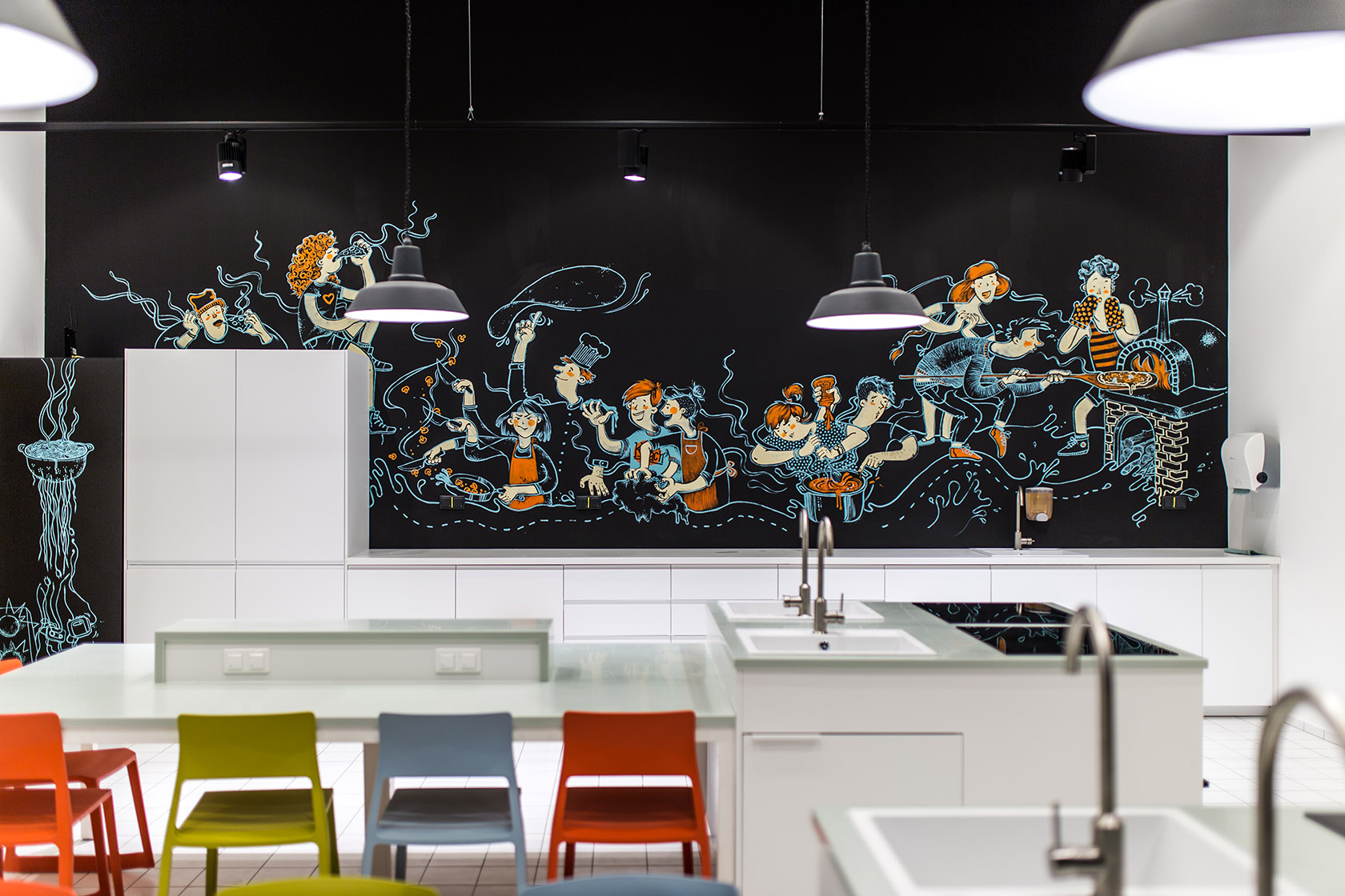
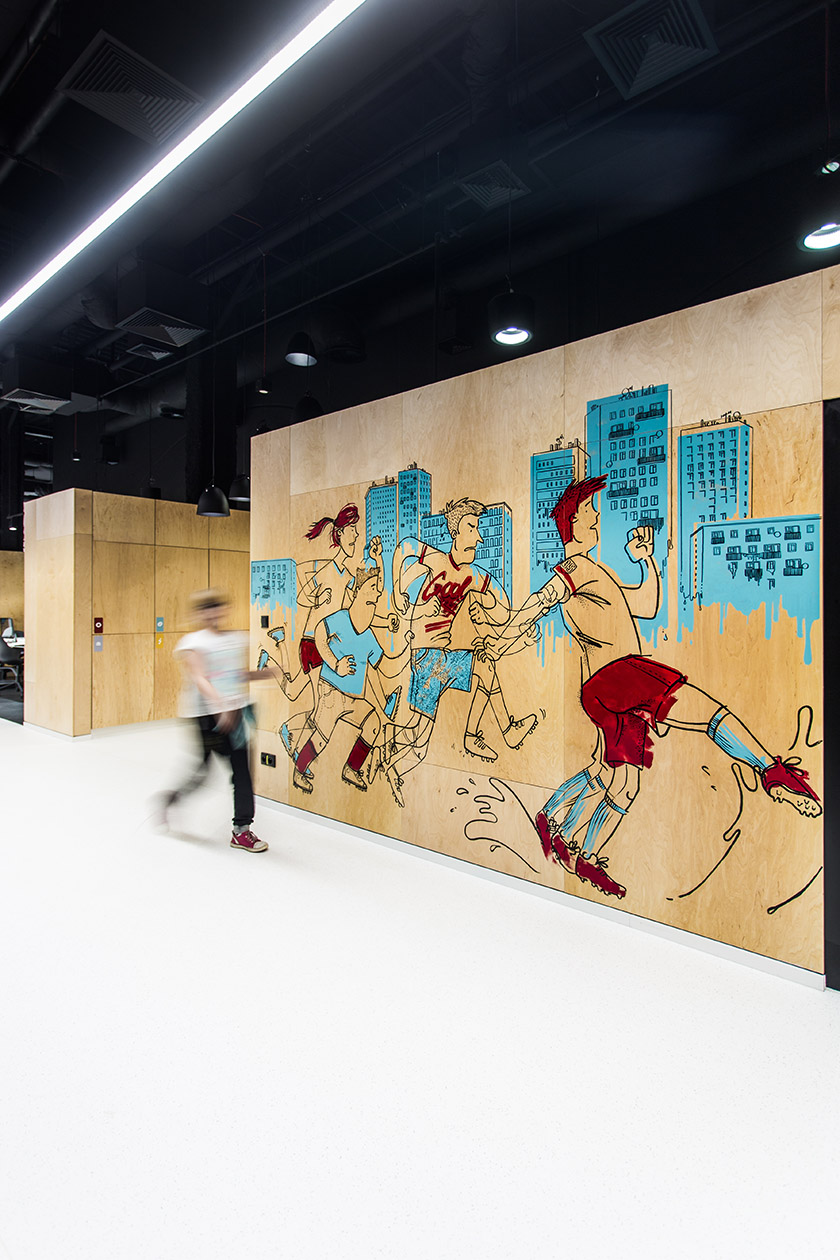
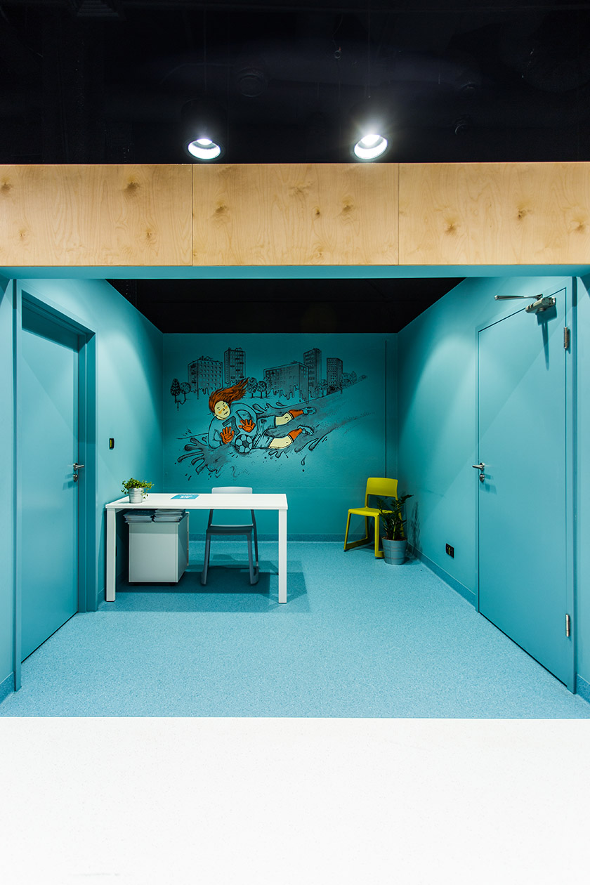
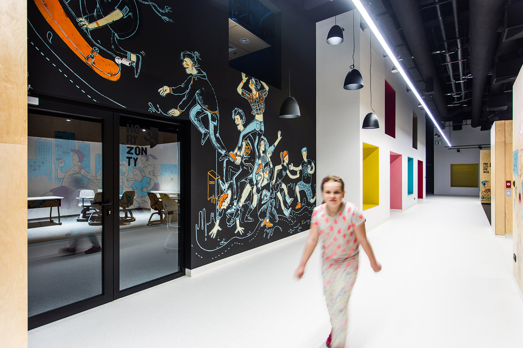
Zuzy Wollny who implemented her illustrations
directly on walls spread all around the Spot and gave the space a special touch.
—
Typeface by: HvD Fonts
Interior design by: ch+ architekci
Client: Amrest
Foto by: Karolina Kosowicz & me
