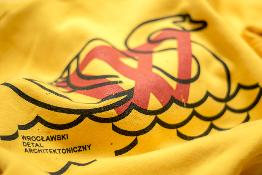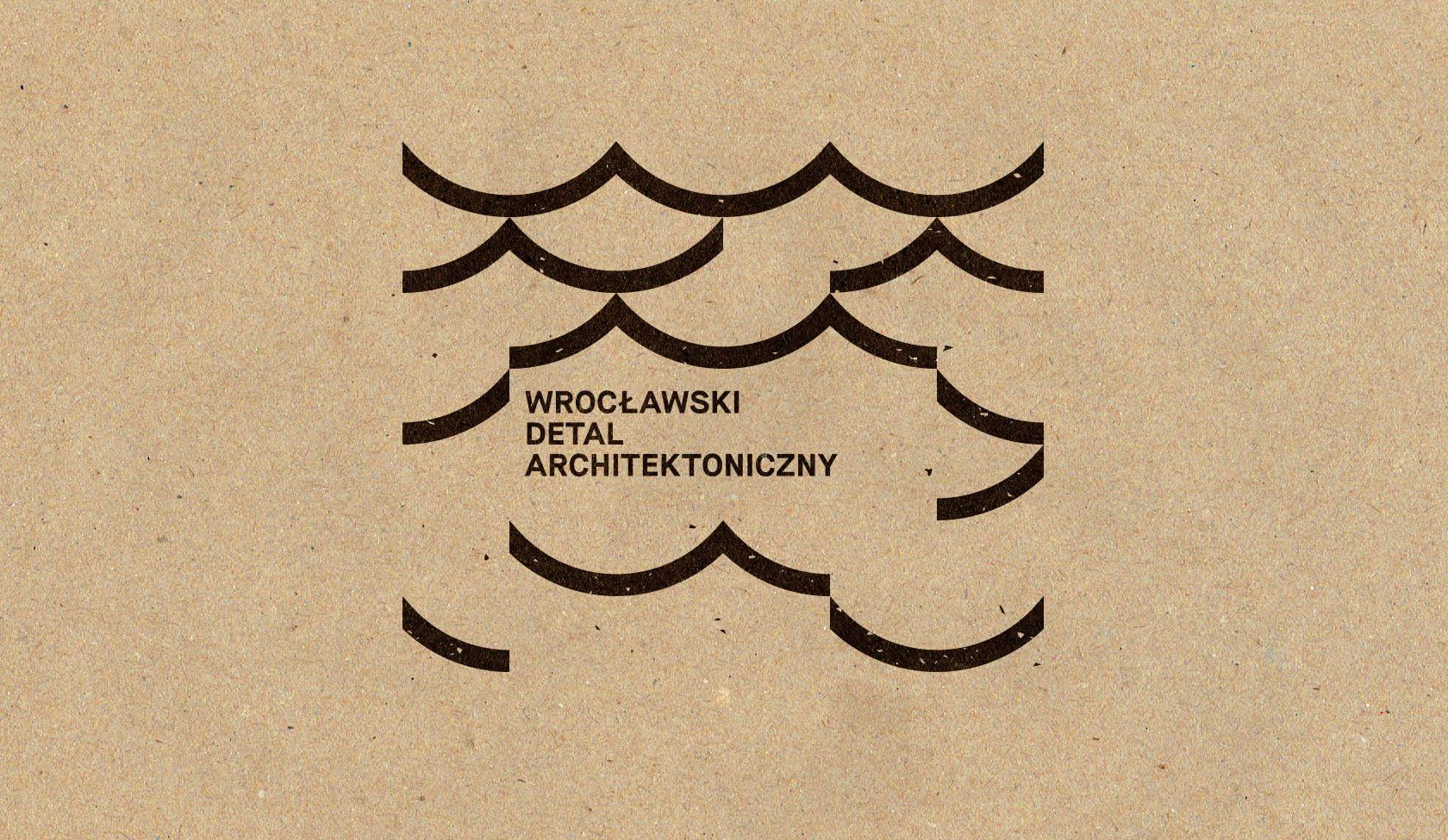
Wrocławski Detal
Architektoniczny
It is profile on Instagram and Facebook which documents details in architecture of Wrocław city.
On the occasion of its first birthday I was invited to collaborate and create gifts for fans.
Limited edition of T-shirts and sweatshirts (100 pieces each), accompanying prints (on eko paper) and a stamp were created.
—
After research in WDA’s documentation I decided to choose two themes.
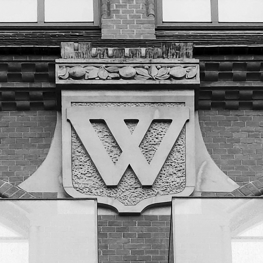
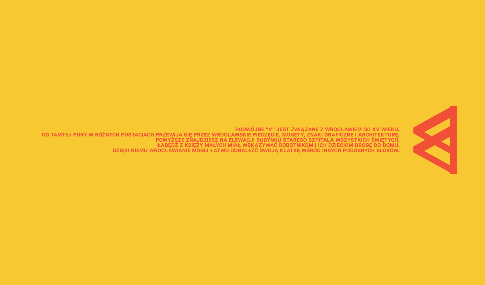
The first one is the double “V”, which has been associated with Wrocław from the 15th century and has been present ever since
through Wroclaw’s stamps, coins, graphic signs and architecture.
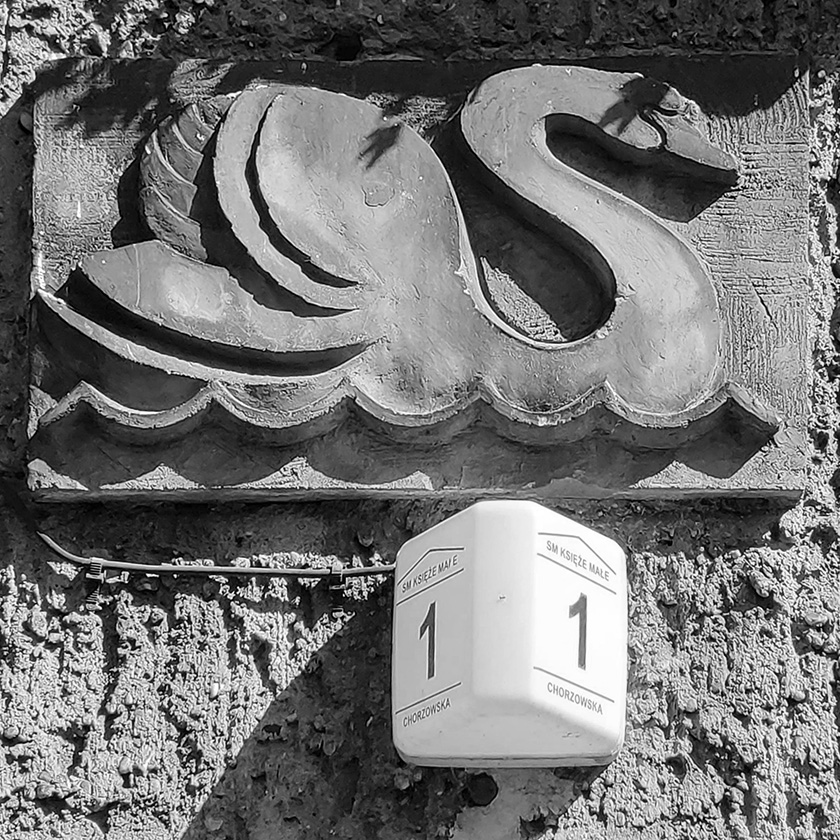
The second theme – a swan from Księże Małe – was supposed to show the workers and their children the way home.
Thanks to it, the citizens of Wrocław could easily find their stairwell among other similar blocks of flats.
The entire project was kept in Wrocław’s colors. The chosen typeface is Maison bold – the same one
which is used by the Wrocław Museum of Architecture.
All of the subcontractors – from the designer, through the sewing room to the printers – are from Wrocław.
In this way a 100% local product was created.